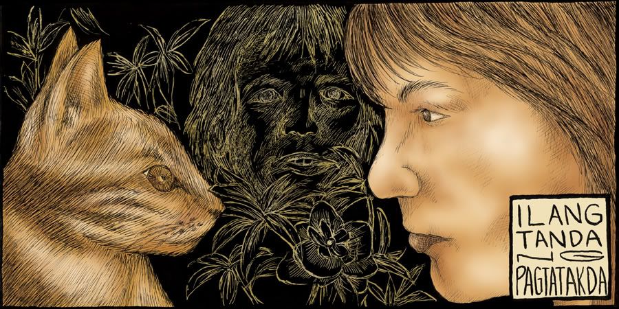
Pen and Ink on bristol / digital coloring. Oktubre 2009. Ang kwento ay isinulat noong 2005.
---
Another comics translation of an old composition. This was first created as a one-page comics for 'Kalasag' (the college paper of the College of Arts and Letters in U.P. Diliman) in 2005.
Pen and Ink on bristol / digital coloring. October 2009. The story was written in 2005.
galing!!!!
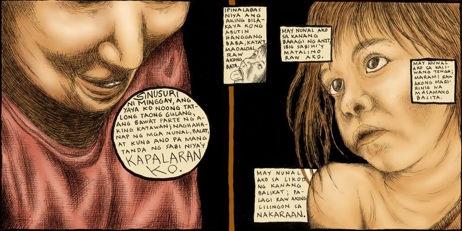
ReplyDeleteGanda nung concept ng pagtatago nung dinedescribe mo through use of narration boxes (ang personal fave ko yung "may nunal ako sa kanang talampakan; marami raw akong pupuntahan at tatakbuhan." na maganda kase yung period, nagmukhang yung nunal na tinatago. Astig.)
ReplyDelete. Maganda kase ganun talaga dapat ang function ng pictures at words to each other sa komiks, or at least yun minsan ang pinaka overlooked function, yung filling in the gaps with each other.
Astig yung flow, makes the story read very well, kaso yung lettering minsan mahirap basahin, pero ayos naman kasi sobrang hirap magletter ng tagalog komiks kasi ang haba ng mga salita.
Yung kinetic energy, kung pano mo ilead yung mata ng tao, oks na oks. Tapos i like the tapering off nung words, yung rythym ay steady then gets noisy sa huli then goes quiet.
Tapos something about the panels are nice, kasi ang panels are big tapos constant sized, pero sectioned off to accomodate littler events, at nakakatuwa yung interplay ng images na sumasapaw sa gutters dun sa sections. (nagramble na ah, hehe). Space= time sa komiks, so yung effect ata yung same sized panels parang sectioning off ng events, kaya para bang me malaki kang subo ng pagkain bago ka sumubo ulit.
Okay din yung pagconnect mo nung last part sa first panel by using the etchy outline nung guy looking through the bushes.
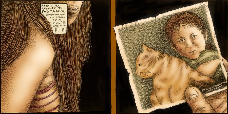
Ah ayun. oks, ganda ganda. Sana marefine mo pa lalo yan at magamit pa sa pagthethesis mo. Tapos cute yung pusa. hehe
-Josel Nicolas
Hello! Salamat sa mga komento :) Marefine pa nga sana bago simulan ang totoong thesiswork hehe. Sana magkomento ka pa pag may bago na (sa dulo ng susunod na buwan pa malamang haha)
ReplyDeletepiya
yeezy shoes
ReplyDeletesupreme clothing
yeezy 350
nike lebron 15
off white
nike lebron shoes
curry shoes
pandora charms
longchamp
off white shoes